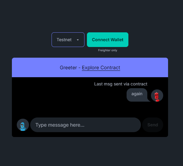
User Interface
This app consists of multiple components coming together to create this single screen that we will later powerup with our contract
Components
For the design of this application we're keeping it simple by creating components using Tailwind for styling and the DaisyUI tailwind plugin to provide us with components.
An overview of the above screen can be found in this snippet:
<main class="min-h-[100vh] flex flex-col items-center gap-4 justify-center">
  <div class="flex gap-2 justify-center">
    <ChainSelect />
    <ConnectWallet />
  </div>

  <div class="relative w-80 md:w-1/2 max-w-lg">
    <ChatHeader />

    <div class="bg-black px-4 pb-4 max-h-[400px] min-h-[200px] overflow-y-auto chat-container rounded-b-lg">
      <div class="chat-block">
        <div class="chat chat-end">
          <div class="chat-header mb-1">Last msg sent via contract</div>
          <ChatBlock username={lastMsgUsername} lastMessage={$lastMessage} />
        </div>
      </div>

      <ChatFooter />
    </div>
  </div>
</main>
Individual Components
Taking the above image and snippet into consideration we can go further into explaining how the components work:
Chain Select
- This is a simple select input that allows us choose the network we want to work with.
<select class="select select-primary" bind:value={selected}>
  {#each supportedChains as chain (chain.name)}
    <option value={chain.name}>{chain.name}</option>
  {/each}
</select>
Connect Wallet
- This is the button that allows us connect our wallet to our app and use it to interact with our contract.
- It also has the ability to disconnect our wallet from our app.
{#if Boolean(!address)}
  <div>
    <button class="btn btn-accent" on:click={handleConnect}>
      Connect Wallet
    </button>
    <p class="text-[0.6rem] text-center mt-1">Freighter only</p>
  </div>
{:else}
  <button class="bg-primary p-4 rounded-2xl text-black" on:click={handleDisconnect}>
    Account: <span class="font-bold">{shortAddress}</span>
  </button>
{/if}
Chat Header
- This exists to indicate the name we want to call our app and also point us to an external link to see all interactions the
Greetingcontract has had since its creation.
<div class="bg-primary absolute top-0 left-0 p-5 w-full text-center text-black rounded-t-lg">
  <p>
    Greeter -
    <a href={explorerLink} target="_blank" class="underline underline-offset-4">
      Explore Contract
    </a>
  </p>
</div>

<div class="h-[60px]" />
Chat Block
- This is used displaty the last message that was sent by calling the contracts
read_titlefunction.
<ChatAvatar {username}  />
<div class="chat-bubble">{lastMessage}</div>
Chat Footer
- This contains the input box we type our intended message and a send button to pass on that message by calling the contract's
set_titlemethod.
<div class="bg-black absolute bottom-0 left-0 px-4 w-full rounded-b-lg">
  <div class="flex items-center gap-1 my-4">
    <div class="h-[40px]">
      <ChatAvatar username={shortAddress} />
    </div>

    <input type="text" placeholder="Type message here..." class="input w-full rounded-3xl" bind:value={message} />

    <button class="btn btn-primary rounded-3xl" disabled={!address || isSending} on:click={handleSend}>
      { !isSending ? "Send" : "Sending..."  }
    </button>
  </div>
</div>
ChatAvatar
- A simple component to have an avatar image, purely for aesthetics.
<div class="chat-image avatar">
  <div class="w-10 rounded-full">
    <img alt="Tailwind CSS chat bubble component" width="200px" height="200px"
      src={`https://robohash.org/${Boolean(username) ? username : defaultName}`} class="bg-neutral" />
  </div>
</div>
This is how our UI is built.
Next Step
The next step is to this app to interact with the blockchain using the contract.
-
We will be using this package; @stellar/stellar-sdk.
-
And some Custom implementations based off packages from soroban-react to tie our contract with the above interface.